Branding

12CP Barristers

Branding & Logo Design

Project Overview

We worked with 12CP Barristers to evolve their brand identity, developing a logo, colour palette and typography system that projected the professionalism and expertise behind the business while feeling approachable and modern.

12CP branded business cards.

Project Brief

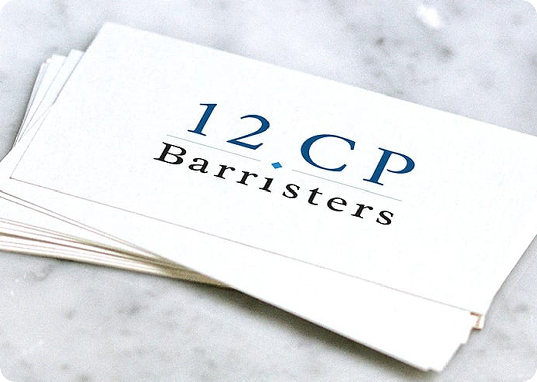
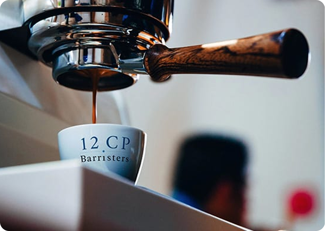
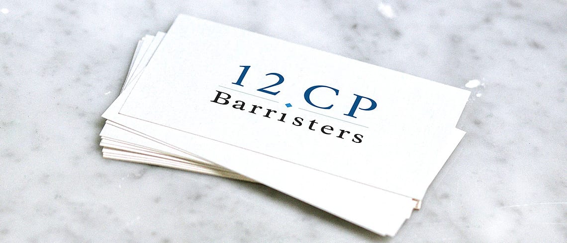
12CP are a barristers’ chambers based in Southampton, offering expert advice across Crime, Housing, General Civil, Planning and Employment. They’re an approachable, professional team known for delivering quality service, whether working as individual barristers or collectively.

Following an office move and name change, 12CP’s existing branding no longer reflected who they were. The identity had not stood the test of time — it didn’t communicate the professionalism or expertise their clients experienced, and there was no visual system that the team could feel genuinely proud of.

They needed a brand evolution that better projected the quality of the work behind the name, while retaining the approachability that set them apart from more traditional chambers.

Our Approach

Logo Exploration & Concept Development

We explored three distinct creative directions: something clean and professional, something more abstract and contemporary, and something that retained elements of the original logo. Starting with hand-drawn sketches, we moved the strongest concepts into a digital workspace to refine the forms before layering in colour and typography. Three fully developed concepts were presented to 12CP for review.

Colour Palette & Typography

12CP wanted to keep their established dark blue but needed a broader palette to work across more applications. We introduced a secondary colour that complemented the primary blue while giving the brand a warmer, more approachable feel. White, grey and silver were added during the website design phase to create contrast across individual page elements. For typography, we moved away from the generic Arial and Times New Roman they had been using, exploring Sans, Sans Serif and Display formats before settling on two serif typefaces that delivered the clean, professional finish the brand needed.

Final Logo Design & Refinement

After a series of iterations, the final logo was developed by combining the strongest elements from two of the three concepts. The result retained aspects of the original identity that the team valued while introducing a fresh, modern feel that better reflected the calibre of the chambers.

The Result

The rebrand gave 12CP an identity that matched the quality of their legal expertise. Since launching, the new look has drawn positive feedback both internally and at industry events, with the team now using a brand they feel genuinely represents who they are.

  • Three creative directions explored and refined into a final logo that combined the best of two concepts
  • Expanded colour palette and professional typography system built for use across print and digital
  • Positive feedback from both the team and industry peers at events, validating the new direction

We have been SO impressed with the service we have received. Having been stuck for sometime with a way of rebranding our business the Atelier team came up with not one but three credible alternatives in a very short period of time. Incredible service and all with a smile.

12CP Barristers

Part of Atelier Digital