Company signage with the Hobbs rebranded logo.
Comparison of the old and new Hobbs logos.
Branding

Hobbs

Branding & Identity

Project Overview

We partnered with Hobbs the Printers to develop a brand identity that reflected their professionalism, warmth and expert approach to print, creating a visual system flexible enough to work seamlessly across both digital and physical touchpoints.

Project Brief

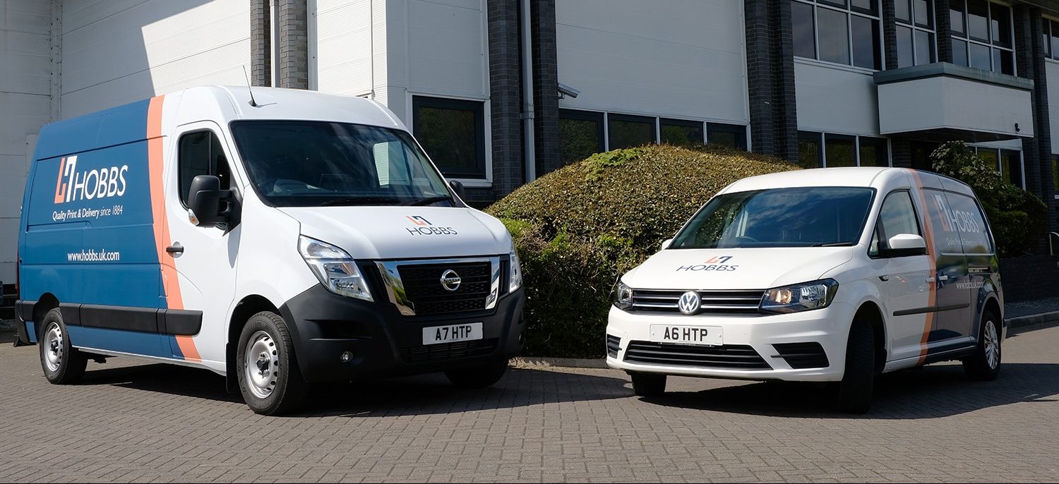
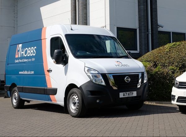
Hobbs the Printers is a well-established printing company with a reputation built on expert processes and a secure, end-to-end service. Their offering spans commercial print, large format and finishing, serving a diverse and growing customer base across multiple sectors.

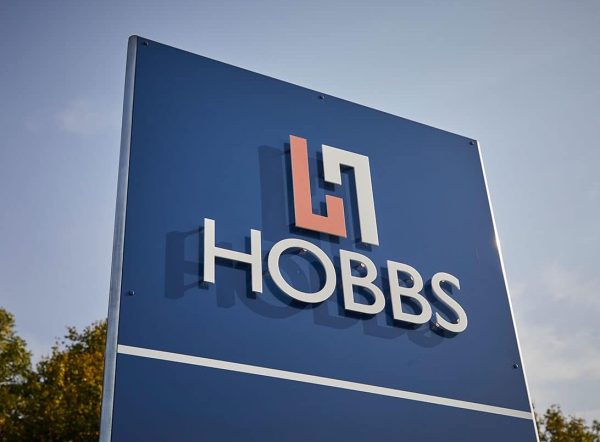
As part of a broader project, which also encompassed the design and development of a new website, we were asked to undertake a rebrand to help Hobbs update and refresh their image.

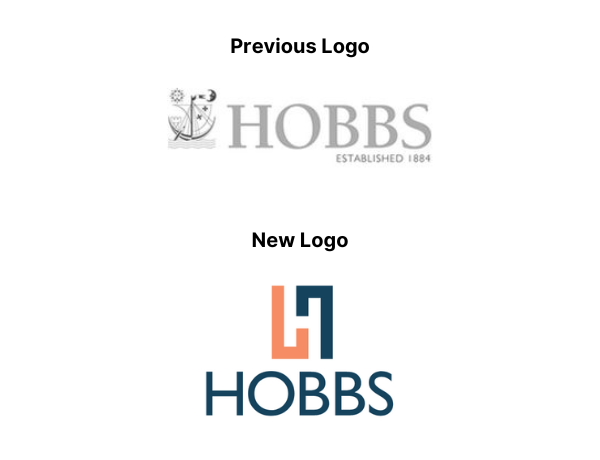
The previous logo did not offer much flexibility, with a limited and restrictive colour palette that was more suited to offline use as opposed to websites and digital assets.

The goal was to maintain Hobbs’ existing legacy and values throughout the improved aesthetic, while also producing something which was appealing to their diverse, growing customer base.

Our Approach

Stakeholder Discovery & Brand Values

We brought key stakeholders together for an in-depth discovery workshop to uncover what made Hobbs different. Partnership, professionalism and warmth emerged as the defining values that would set the tone for every creative decision that followed. These weren’t just words on a page – they became the foundation the entire brand was built around.

Visual Identity & Logo Development

We developed a new logomark that evoked process and circularity, reflecting the secure, end-to-end nature of Hobbs’ service. The mark was designed to work as a standalone element across smaller applications like uniforms, signage and social media, as well as alongside the full wordmark.

Colour Palette & Brand System

Through guided creative direction, we developed a colour palette that balanced professionalism with warmth. A deep navy and a vibrant orange were selected as the two primary brand colours, giving Hobbs a visual identity that felt established yet energetic. The palette was built to perform equally well across print, digital, signage and branded materials.

Two vans branded in the new Hobbs logo livery.

The Result

The rebrand gave Hobbs a visual identity that works as hard as they do. The new brand system has been rolled out across every customer touchpoint, from their website and digital presence through to vehicle wraps, uniforms, signage and printed materials, creating a consistent, professional look that their growing customer base now recognises immediately.

  • A values-led rebrand rooted in stakeholder discovery, giving Hobbs a brand that reflects who they are and how they work
  • New logomark designed to work standalone across digital, print, signage and branded materials
  • Full brand rollout across vehicle wraps, uniforms, signage and digital assets, delivering a consistent identity at every touchpoint

I just wanted to thank Atelier for the great work you have done on our behalf. The new logo has also been very well received with the vast majority of our staff very happy to be wearing polo shirts displaying the logo; our recently purchased delivery van also looks very smart with the new branding.

David Hobbs

Managing Director

Part of Atelier Digital