


Updated 2nd September 2026
Product page design: What customers need before they buy
There's a moment on every product page where a customer either commits or clicks away. It usually happens in seconds, and it's rarely about the product itself. It's about whether the page gave them enough to feel sure.
We've been building websites since 2001, and the pattern hasn't changed much. Traffic isn't usually the problem. The problem is that people arrive, look around, don't find the one thing they needed to know, and leave to go and find it somewhere else. A good product page removes those small moments of doubt one by one until buying feels like the obvious next step.
Here's what customers actually need to see.
Make the value proposition immediately clear
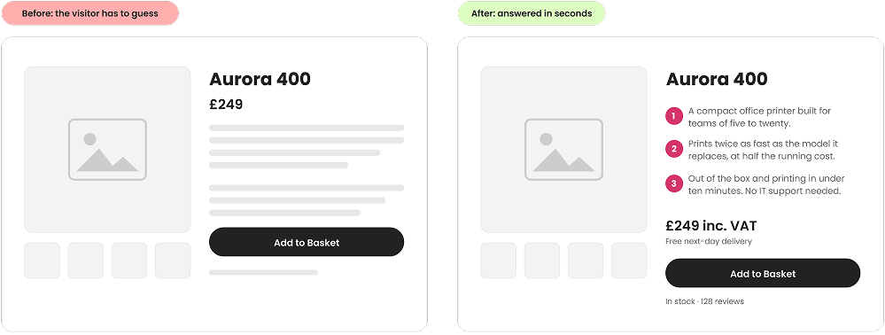
Within a few seconds of landing, a visitor should be able to answer four questions: what is this, who is it for, why is it better than the alternatives, and what's the main benefit to me?
That sounds obvious, but plenty of product pages open with a name, a price and a photo, and leave the rest to guesswork. Lead with the thing that matters. A clear product title, a short supporting line that says who it's for, and one strong benefit statement will do more work than three paragraphs further down the page.
Use high-quality visuals
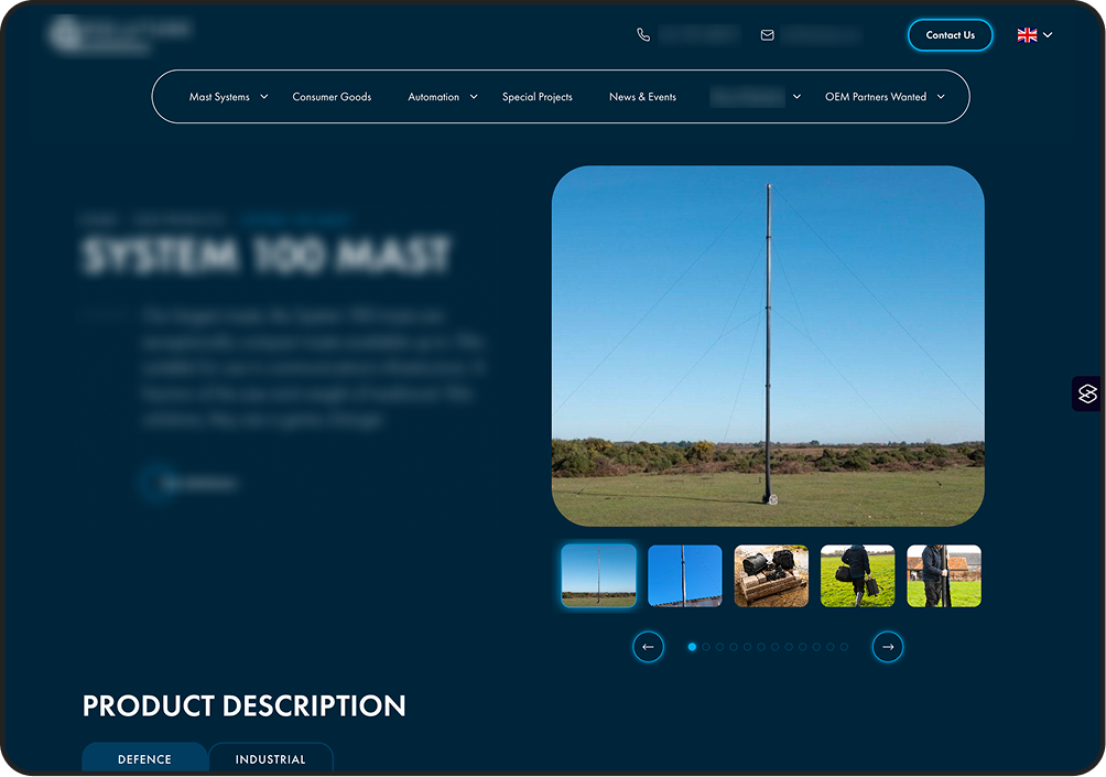
Customers can't pick your product up, turn it over or try it on. Imagery has to bridge that gap, and thin imagery is one of the quickest ways to lose a sale.
Give people plenty to look at:
- Multiple product photos rather than a single hero shot
- Different viewing angles, including the back and the underside where it matters
- Zoom functionality so detail and texture can be inspected properly
- Lifestyle imagery showing the product in a real setting and at a sense of real scale
- Video demonstrating how the product works, fits together or performs
Scale is the one people forget most often. A product photographed on a plain white background could be any size at all. Put it on a desk, in a hand or in a room and the guesswork disappears.
Write benefit-led product descriptions
Specifications matter, but on their own they ask the customer to do the translating. "2,400mAh battery" means very little. "Runs all day on a single charge, so it's ready when you are" means something immediately.
The best descriptions do both. Lead with the benefit, then back it up with the specification for the people who want the detail. That way you're serving the browser and the researcher on the same page without making either of them work for it.
Be transparent about pricing
Unexpected costs send shoppers away at the last moment, and it's an entirely avoidable loss. Nobody minds paying for delivery. People mind finding out about it at the final step, after they've already decided to buy.
Show the full picture up front:
- Clear pricing, prominently placed
- VAT information where relevant, especially on B2B sites where the distinction matters
- Delivery costs, or a plain explanation of how they're calculated
- Finance options if you offer them
- Subscription details, including what happens after the first payment
- Any discounts or promotions, with the terms stated simply
Transparency is one of our core values, so we'll put it plainly: no surprises at the last step. Your customers deserve the same courtesy you'd want yourself.
Display trust signals
People need reassurance before they enter payment details, particularly if they've not bought from you before. Trust signals do that job quietly.
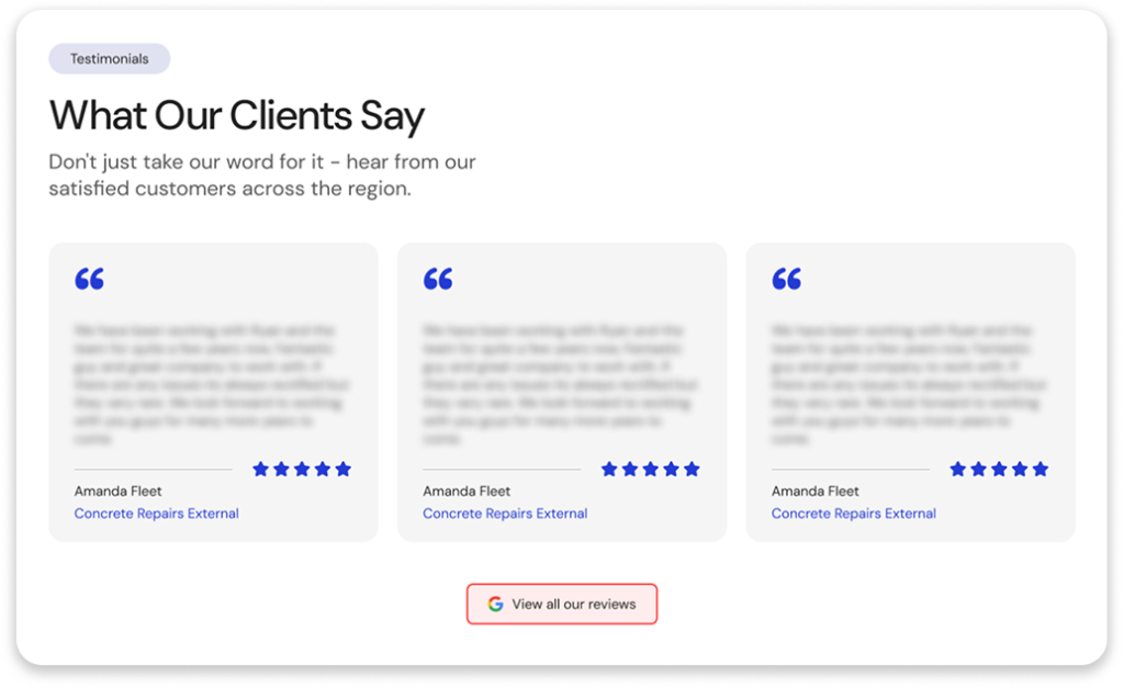
Customer reviews and star ratings carry the most weight, but they're not the only option. Secure payment icons, industry certifications, awards and verified testimonials all help. So does making it easy to find out who you actually are. A visible phone number or address reassures more people than most businesses realise.
Help customers compare options
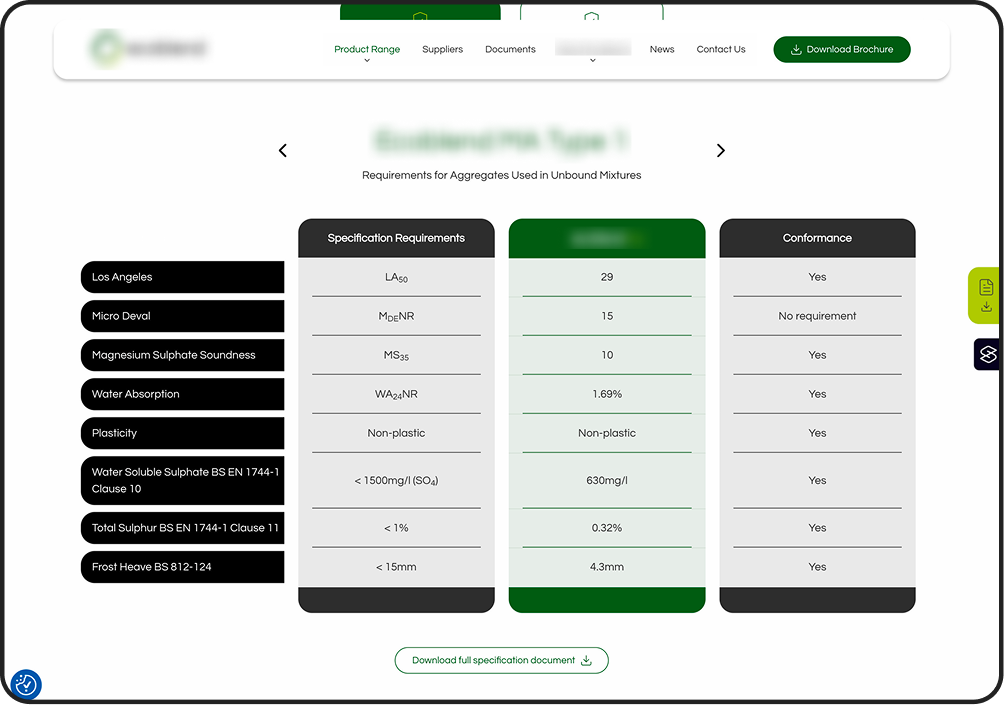
If your products come in variations, make comparing them effortless. Every moment a customer spends trying to work out the difference between two options is a moment they might spend closing the tab instead.
Size guides, colour selectors, material comparisons and clear specification tables all reduce that friction. For clothing and footwear in particular, a genuinely useful size guide does double duty: it wins the sale and prevents the return.
Answer common questions
Every unanswered question is a reason to leave. An FAQ section on the product page catches the ones that would otherwise send someone to your contact form, or to a competitor.
Worth covering:
- Shipping information and timescales
- Returns policy, in plain language rather than legal wording
- Product dimensions and weight
- Care and maintenance instructions
- Compatibility with other products or systems
If your customer service team keeps answering the same question, that's your FAQ writing itself. Listen to what people actually ask rather than guessing.
Make calls to action impossible to miss
The "Add to Basket" or "Buy Now" button should never be something a customer has to hunt for. It needs to be visually prominent, easy to find, available without excessive scrolling where practical, and clearly labelled so there's no doubt about what happens next.
Keep it to one primary action. When a page offers several buttons of equal weight, it stops guiding and starts asking the customer to make a decision they didn't come here to make.
Show availability and delivery expectations
"When will it arrive?" is one of the last questions before purchase, and answering it on the product page rather than at checkout removes a real barrier.
Show in-stock status, estimated delivery dates rather than vague ranges, click and collect availability, and the delivery options you offer. Low stock notifications work well too, as long as they're genuine. Customers spot manufactured urgency quickly, and it costs more trust than it wins sales.
Let other customers do the talking
People are reassured by other people. Written reviews, case studies, "most popular" indicators and thoughtfully chosen related products all signal that others have made this choice and been happy with it.
Reviews with detail and photos are worth far more than a bare score. "Most popular" labels are quietly powerful too, because customers who can't decide between options will often take the hint gratefully. On higher-value or more considered purchases, a short case study earns its place: it shows the product working for someone whose situation looks like the customer's own. And a well-chosen related products strip catches the visitor who's nearly convinced but suspects there's a better fit one click away.
Optimise for mobile shoppers
Plenty of your customers are buying on a phone, often on a train or a sofa with half their attention on something else. Mobile can't be an afterthought.
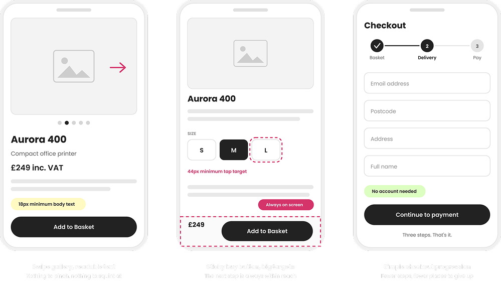
That means large tap targets, text that's readable without pinching, sticky purchase buttons that stay in reach, fast-loading pages and image galleries that swipe naturally.
Checkout progression deserves its own mention, because it's the point where a customer has already decided to buy and can still be lost. Keep the steps few and clearly signposted, show progress so people know how much is left, don't force account creation, and make sure every form field is easy to complete with a thumb. Page speed matters just as much, because a phone on a patchy connection has far less patience than a desktop.
Reduce cognitive load
All of the above only works if the page feels calm. Clear hierarchy, plenty of whitespace, consistent typography, a logical information order and simple navigation let a customer take in what they need without effort.
Cluttered pages don't feel busy to a customer. They feel like hard work, and hard work is easy to abandon.
Bringing it together
A product page is more than a digital catalogue entry. It should answer questions, build trust, and make the buying decision feel straightforward.
When customers can quickly understand a product's value, verify its quality and purchase with confidence, businesses tend to see stronger conversion rates, fewer abandoned baskets and higher customer satisfaction. Those three things compound, and they all start with the same thing: giving people what they need before they have to ask for it.
If you'd like a fresh pair of eyes on your product pages, we're always happy to take a look. Send your brief or just chat through your ideas, no obligation or hard sell. We don't bite!
Are you ready to meet your new digital team? Get in touch with the experts at Atelier Studios.